Friday, August 31, 2012

A Month (or Two) in Review

Today celebrates two months passed since we officially moved into our new abode, and things have come a long way, baby! I figured that today's post would be well spent on reflecting on the things we've already accomplished, and setting new goals for the future. Plus, being the flagrant list-maker that I am, I need a good way to organize projects, and keep on the straight and narrow of accomplishing them (I'm also infamous for starting a project without finishing it).

The living room was the first room we tackled after moving in. The vivid orange and yellow "mac-and-cheese" walls had us singing the blues (cue adorable kids from the Kraft commercial), but a creamy white helped temper the blazing ambiance of the room. Read more about the transformation here.


We also painted the upper wall on the fireplace a grayish clay color to give it some depth and contrast. The black mirror, candlestick, and picture frame accessories on the mantle also received a mini makeover. Check out the before and afters here and here.


Finally, we added some color and drama to the large window on the far end of the room with some custom made curtains. Check out the transformation here, and you can find the tutorial to make your own here.


In the kitchen, we gave you the grand tour and a mini makeover of the upper half of the walls. We're far from done in this room, so I'll be adding quite a few projects to my "To Do" list. Check out the first half of our plan here.


Upstairs, we ripped out the dirty, smelly carpet and transformed our former "Blueberry Room" into a space fit for a little princess. Check out that amazing transformation here.


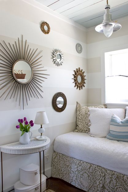
We also started the serious-budget makeover of our guest room. It's far from finished at this point, but we have some fun organization and craft projects to add to the "To Do" list. Check out all of the details here.


Overall, I think we've accomplished a ton of things in the first two months of living here. We've also got a long way to go to finish some rooms, and yet to start on others. Here is a small list of things I hope to finish in the up and coming months:

Living room:

1. Clean and paint the interior of the fireplace/hearth.
2. Unify the fireplace accessories by painting them a matching color (ORB).
3. Update the lighting in the living room with some matching lamps, and paint the silver torch lamp ORB.
4. Bring more color and texture to the living room with artwork and pillows.

Dining Room:

1. Settle on a jewel-tone paint color that ties in with the living room, and creates a little more drama.
2. Line the drawers and wall on the upper cabinet of the bar to give a more finished appearance.
3. Raise the curtain rods above the windows and lengthen the drapes to add visual height to the room.
4. Find a rug to define the dining space and add some texture.

Kitchen:

1. Paint the lower half of the walls.
2. Add storage to organize drawers and shelves.
3. Line the drawers and shelves.
4. Window treatments

Foyer:

1. Paint!
2. Caulk the front steps (you can see through cracks into the basement)
3. New window treatment

Sun Porch:

1. Paint the ceiling a calming blue tone and the walls a nice beige.
2. Seating
3. New window treatments

Guest Room:

1. New curtains
2. Storage and organization in the closet
3. Furniture

Master Bedroom:

1. Paint
2. Furniture
3. New curtains
4. Vanity area
5. Organize/paint the walk in closet.

So much for a "small" list! This is just a random "off the top of my head" list of things I would like to accomplish. There are a bunch of smaller little things that fall into some of these categories, but I think this overall list will keep me going strong and give me lots to do in the months to come. Stick around and help me stay on track! :)

Wednesday, August 29, 2012

It Ain't Easy Being Green...

I've put a lot of thought into our dining room lately. When we initially moved in I thought that the dining room was going to be the only room left "unchanged" on the downstairs floor, but I've been having second thoughts about that lately. Now that we've narrowed down somewhat of a color scheme for the living room after painting (click here to see the paint transformation that room has undergone), I am not sure how well the apple green color plays into the more jewel toned teal of the living room. Yes, they're both green(ish), but somehow I think that they might clash. Here's a little more insight as to how our living room has transformed from move-in day. She looked a little something like this:


If you are unfamiliar with the layout of our home, the above picture shows the angle from the back of our dining room. The upper left side (yellow room) is our living room, and the doorway on the right leads into the kitchen.


The above picture was taken at the entryway into the dining room from the living room. The owners tan curtains with green beaded leaves were in sad shape from what looked like several climbing episodes from a cat. There's also a handy lesson to be learned by looking at them, too. See how short and squat the room looks? A lot of that perception has to do with the curtains. Not only are they mounted on the wood frame of the window, but they pool onto the floor. Simply raising the height on the curtain rods, and maybe extending them a few inches past the window frame will not only make the windows look much larger, but it will also add some visual height to the room. Easy remedy that has a huge payoff. Kind of like paint!


This view is taken from the doorway of the kitchen. Here you can see the same curtain dilemma from a different angle, and also a view of the bar. These were all taken on move-in day. Here's what the dining room looks like with our furniture unpacked and arranged in the room.


I haven't taken the time to adjust the curtains yet, but I did switch out the rods for a set of our own. The curtain panels are simple gray and white panels purchased from Target. Our dining room table and desk were Better Homes and Gardens clearance bargains from Walmart. The table top features a table decal from Luvloo.com that I won through a blog giveaway on IHeartOrganizing. I love it because it protects the table top without the need for a table cloth. The table looks so much more streamlined, and I don't have to worry about a toddler pulling my table cloth (and whatever might be sitting on top of it) to the floor. 

So tell me, do you think the apple green should stay, or should I start looking for other paint options? I'd like to keep things pretty cohesive in the house. I'd like it to be soothing without being too devoid of color. Using the same color we painted our fireplace wall came to mind (Glidden's "Clay Bisque"). I've also thought about darkening it up a little more with a deeper emerald or teal color. I've been really into jewel-tones lately. What do you think? Any suggestions or opinions?

Monday, August 27, 2012

Ahoy! Makeover in progress!

Last week I told you about my plans to makeover the guest room in our house. We need a space that will serve a multitude of functions in a tiny floor plan. The first part of that plan was freshening up the walls a bit. They were a tad boring, and the chocolate brown accent wall only enhanced the scuffs and drywall imperfections left by the owners. Here's where we left off:


Before starting my plans to paint, I decided to go down to our basement and take inventory of the paint stock down there. The owners have left all of their paint cans behind which would make touchups great if we left the rooms that color. It seems a shame to let the paint go to waste, but unfortunately their color pallet just wasn't in our taste. One can struck my fancy, however. It was labeled "Fence". I had to do a double take on the label because it was a latex based indoor paint. It had appeared that the can was an extra from when the fence was installed (back in 2005?), because it was unused. Still, I couldn't help but shake my head at the thought of the owners using an interior paint on the privacy fence that enclosed most of our back yard. The other intriguing part is that it seemed to hold up pretty well (the label on the can was printed in 2005 when the paint was mixed so I assume that's around the time when they built the fence).


Not too bad considering a majority of that fence line sits beneath several trees. The winter weather here in upstate New York is also pretty harsh, and it's managed to last pretty well despite those conditions. The color has oxidized a bit and appears to be more blue than what the can portrays, but I must admit that I am impressed!

I've heard varying opinions on how long leftover paint is supposed to last, too. I'll admit that I was hesitant to use a paint that was mixed over 7 years ago, but, after a few stirs with my wooden mixing stick, everything seemed to be just fine! The color was still dark and it applied evenly to the wall. Painting the accent wall was great, but the walls still seemed to be missing something. After browsing Pinterest, I hit up some of my favorite blogs, and settled on an inspiration photo of Kevin and Layla's small guest/reading room on their blog The Lettered Cottage.


I just love what the stripes have done for the visual interest in this tiny space. Read more about their transformation here

So armed with a pencil, tape measure, and painters tape, I began the arduous process of creating horizontal stripes on the walls. Here I am about halfway done with taping.... (get a load of how nice that blue turned out, to!)


And then I ran out of tape, so I sent the husband on a mission to grab more tape on his way home from work. 


Although I didn't take any pictures of the finished taping project, let me just say that not all tape is created equally. The blue tape you see on the walls is my good old stand by 3M painters tape. It's an adequate tape for relatively low cost, and it gets most jobs done. The DH brought home a roll of the green stuff, Frogtape, and honestly not much else can really compare to it. I'd never tried the stuff before because the price of it scared me away, but let me just say that it is WORTH every penny! If you can get over the sticker shock, grab yourself a roll the next time you take on a painting project, and you won't be sorry. The following pictures may not show in detail why, but if you were to see it in person, you could see that the blue tape lines are not as crisp as the green even after smoothing the edges of the blue tape extra well to ensure a good stick. 3M, I'm sorry to part this way. We've had a good run... but it's over. It's not me, it's you. 


I tried to organize my craft mess as best as possible for you. A for effort, right? :)


Overall, I am completely thrilled with how the room has turned out, and the only thing spent was $10 for a new roll of tape (of which I still have plenty left over for other projects). Next on the list? I think I need to get some of my craft gear organized, so I'll be on the hunt for a good way to store everything. We're also in need of a daybed so that our guests can have a place to sleep, and I am already fabric shopping for new curtains (priorities, people)!

What do you think? Do the stripes get your vote? Have you completed any room makeovers under $10 lately? What kind of storage organization would you recommend? 

Friday, August 24, 2012

School House Kitchen

The owners struck again with their painting genius, and tried to color-match the walls to the curtains. This time they've added extra 'umph with the matching cabinetry. The all-yellow walls,  blue lower cabinets, and red uppers seems like it belongs on an episode of Sesame Street rather than in our house. Here are a few candid's from move-in day.


Can you see the dangling pull chain of insanity hanging from the center of the room? Yes, that goes to the florescent light on the ceiling. The crafty owners poked a hole through the light cover instead of A) wiring the light to a switch on the wall, or B) using a different light fixture all together. There's nothing better than walking through the kitchen and getting smacked in the face with the cord of your pull-chain lighting (bonus: it has an obnoxious bauble on the end). Seriously, how could anyone have put up with that!? 

Despite the elementary color scheme and annoying lighting, the kitchen really has a lot to offer. Firstly, it has WAY more counter and cabinet space in comparison to our previous home. It was also bigger and more updated than most of the other places we had checked out. Glass tile backsplash, blonde wood laminate flooring, and pull-out shelving were a good first effort in updating the space. The kitchen, however has the opportunity to really freshen up with some new paint and different window treatments. Lets start with paint, shall we?

When we were paint chip shopping for our living room, you bet your bottom that I picked out a few things I had in mind for the kitchen, too. I needed something that fit with both the red and blue cabinets (those will go unpainted for at least a little while), and also be cohesive with the rest of the house. Seeing how the kitchen has a faux tile backsplash which comes up just a little more than half of the wall, I thought it would be a good idea to use that as a natural separation line to use two contrasting colors. I think it will give the kitchen a little dimension rather than being one flat color. For the upper portion of the walls, I chose to use the same color as the living room: Glidden's "Swiss Coffee". Not only did it allow us to save a few beans by using leftover paint, but it brought just the right touch of creamy lightness to the room. See for yourself. 


Can you tell how much more light, open, and dimensional the space already feels, even with the dark, heavy curtains still on the window? Yes, the yellow is still there, but overall it has added some depth to the room. Here's how it looks on the other side of the kitchen:


Better? Our fur babies seem to think so. They curiously sat and watched as I carried my paint supplies from one end of the room to the other, and then also back and forth between the kitchen and living room. It was much easier to just paint everything at once while I already had the supplies handy so I did it on the same day. 

The bottom half of the walls are still  yellow, but I have already swatched and settled on a new color. We'll be using Glidden's "Wood Smoke". It's a brownish-gray that I am hoping will balance out the space. It is a good dark contrast to the creamy white on the upper half, but it is not nearly as dark as the blue cabinetry.  I've been leaning towards a semi-gloss finish, especially since it is on the lower half of the walls. It should make cooking splatters and toddler smudges much easier to wipe clean. Plus, the faux tile texture will be well suited for that semi-gloss sheen. The power of paint is our best option to transform a space on a renter's budget, and I am looking forward to seeing how everything comes together. I've got so much envisioned for the kitchen. From paint, to decorative storage. You won't want to miss it, so check back again. Hopefully we'll have an update soon.  

Wednesday, August 22, 2012

That's So Pinteresting: House of Mirror's

Usually I turn to Pinterest when I need some help in conjuring up craft or design ideas. Knowing what you want and translating that into something you can execute can often be a hard thing to do. I'm a pretty visual person, too, so being able to see something that I like right in front of me can help me envision how to create what I want. This week I announced that I would be starting the makeover of our guest room. This room has two decently sized windows, but can sometimes feel small and dark. I'd like to hang an arrangement of mirrors to help open the space up a bit, and add some interest and light. Here are some inspiring pictures that found their way to my Pinterest wall this week:


Is there really such a thing as too many mirrors on a wall? Could you blame anyone for wanting to put that theory to the test? Mirrors have been the trickster friend for ages. They span beyond the looking glass these days, and designers have been incorporating them in their designs for a multitude of reasons. Just look at how airy and light the rooms in the pictures above feel. The ornate and architecture of the mirrors also provides interest, and the light reflected really brighten up the space. Let's not forget to mention how much bigger they make the room feel!


The star-shaped mirrors above are a favorite. I would love to find a pair like that to hang on the wall in our guest room. They're so playful! The great part is, they work in any room-- not just the bathroom! 


What do you think about mirror clusters? Do you think they're over done, or the right amount of chic? Have you incorporated them in your home decor? What has your eye in Pinterest this week? 

Monday, August 20, 2012

Ahoy! Makeover Ahead!

Now that the former"Blueberry Room" is the feminine, pink home of our daughter, I am ready to turn my focus onto the spare room. I plan to use this space as a bedroom for my stepson when he comes to visit and as a craft studio for my Etsy shop, Little Lotte, but at the moment it is lacking in design and organization (which is not very motivating in terms of getting some work done, plus my shop has been on vacation since we started our move). Hopefully a little makeover will make it a place that not only keeps my creative juices flowing, but will make me want to spend more time in there while providing an excellent home away from home for our other kiddo. Here's a view into what we're dealing with (brace yourself, we're keeping it real):


Chocolate brown accent wall? I like the idea, but not my preference in color. The finish is also pretty awful, and brings out a lot of the flaws of the drywall. It's also strange how the owners brought it around the corner to meet the doorway, but didn't carry the color across to the other side. They also left the corner trim white which, to me, looks odd.


The closet is located in an awkward place behind the door. It's also raised several inches off the ground to make room for the ducting of the heating vent. The single hanging rod and small shelf above are a poor use of space, though, so I hope to add a few more shelves at the bottom for organizational functionality.

Of course I've turned to Pinterest for organizing my ideas and to gain inspiration. Here are some of my favorite's:


Sensing a theme here? While I'm not interested in creating "The Blueberry Room 2.0", I would like to use a navy shade on the accent wall that is currently brown. I think it creates just the right amount of chic drama that I am looking for, and is fitting for a young boy. Best of all, I can do it on a serious budget since the owners already have this color on hand. That's right-- I won't have to spend a dime on paint!

I've also got some great ideas for a desk/workstation and some artwork that I am beyond excited to try out. This might turn out be the biggest and best nearly-free makeovers that I have ever done, so you won't want to miss a second of it! Stay tuned to see what I've got up my sleeve!


Friday, August 17, 2012

Setting the Bar...

When I posted our house tour, I briefly mentioned that there was a "bar" at the corner of our dining room, but I didn't lead into much detail or post pictures of it. My intuition leads me to think that the cabinetry used to create this little treasure haled originally from the kitchen, and was relocated after a series of renovations. I quite like it's placement, and it provides the perfect place to entertain guests or even just ourselves! Here is a snapshot from the day we moved:


The owners updated all of the hardware, added some chrome stemware racks, and left the upper doors off of the cabinets to give it an open shelf feel (and get a load of those curtains). There are a few things that I am looking forward to changing (like perhaps some patterned paper on the back of the cabinet to give it some interest and perhaps updating that old globe-style thermostat). 

Overall it's a great setup, and conveniently located. It also seemed like the perfect place to park my beloved Keurig and the cabinetry below is an excellent place store our coffee and cups. Here's what our initial set up looked like once we had unpacked a few things:


I pretty much gave my husband creative freedom of the open cabinets so he had a place display his Buddha figures and military ball glassware. Sometimes I feel a bit guilty because I sort of take over on the style/design of things. On the very top of the cabinet is my small collection of German cookie tins. I love how eclectic and  pretty they are, but they're also an excellent way to store small things.


The bamboo mat on the top of the cabinet belongs to the owners, and was left behind along with their curtains. I've changed the matchy-matchy curtains out for a more simplistic gray panel, but I am still on the hunt for something that better fits the top of the cabinet. I just don't feel right about cutting this mat down to size because it isn't mine. I'm sure Pier 1 has plenty of options-- I could seriously spend all day in that place. 


I've found myself rotating between containers to store the coffee, and in the time between taking the pictures and posting them here, I've already made several changes. I wanted something that would provide easy access to the coffee but also keep it fresh. After a little shopping in my kitchen, I came up with a couple containers that I purchased in a set from Target. They even have little scoops on the side to help measure out the coffee and sugar. Maybe one of these days I'll invest in a Silhouette by Cameo and go on a desperately needed labeling spree. 

(Don't worry-- I used the Keurig just before taking this photo. It's not dirty-- only wet.)


I spent some time organizing the inside of the cabinet as well. I used some tin planters leftover from a previous birthday favor to stash some of my favorite K-cup flavors for the Keurig. I also found an awesome roller-top box that I found at the Goodwill for only $2.50. It's perfect for organizing tea, and I've got plans to spruce it up with a little paint and scrapbook paper. 


So what do you think about the new bar trend these days? Do you have one set up in your home, or do you long to create one? Have any tips for keeping it organized? Share your thoughts or ideas! 

Wednesday, August 15, 2012

That's So Pinteresting!

I've been contemplating a weekly themed post, and what better way to connect to DIYers of all types than through one of our favorite mediums- Pinterest! Are you as addicted to that place as I am? To kick off the very first series of "That's So Pinteresting", I thought I would dedicate today's topic to one of the latest things to hit my boards:  Mosaic's.

After finishing my curtains, I noticed while editing the photos how bland my end tables look (ever notice the different perspective photographs offer? Weird, huh?). They're dark and muddy looking against the teal Ikat patterned fabric not to mention their finish is a little worse for the wear after moving several times in the last few years. I love these tables, though. The deep-set top has prevented many a spill from a tipped-over glass from spreading. The legs were a bit rickety, though that was nothing a little bit of Loc-tite couldn't solve (the bolts holding the legs onto the top kept coming loose). But what could I do to transform the top into something durable and fabulous? I thought about painting the tops. I thought about using decorative paper and Mod Podge. I even considered making a type of shadow box by installing a glass top. But after turning to my fabulous friend, Pinterest, I knew exactly what I wanted to do: a mosaic!


Isn't that herringbone tile design just dreamy? Love it. How about this gorgeous flower piece? 


Or something with a little ethnic flavor? I adore these intricate Moroccan tile designs.


I can't deny my draw to the blue tones. My husband think's it's a sickness (I'm still in denial), but it's also a great way to incorporate dimension in the space to contrast while still blending with the teal. Check out this mosaic design. It's one of my favorites. So simple looking yet so intricate. And, yes, hints of blue. My fave. 


I think a tiled top would really take my end tables from dark and boring...


To unique and sophisticated!


Once again, thanks to Pinterest, I now have some more supplies to add to my "To Do Shopping List". I've never tiled anything before, so this should be a fun learning experience! Have any tips or tricks to share? What projects have you been pinning lately? 

By the way, if you'd like to read more about the curtains click here for the project reveal, and here for an easy-peasy tutorial! Enjoy!